


Introduction
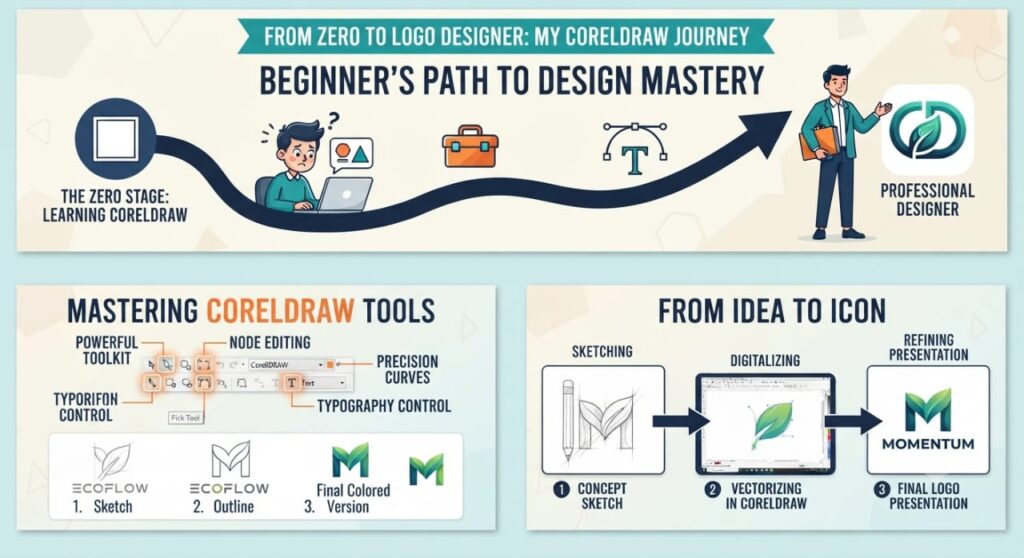
From Zero to Logo Designer: My CorelDRAW Journey is a story about learning graphic design from the beginning and gradually developing the skills needed to create professional logos. When I first started using CorelDRAW, I knew very little about graphic design. Tools, shapes, colors, fonts, and vector graphics all seemed confusing.
With regular practice, however, CorelDRAW became easier to understand. I learned how to create simple shapes, combine objects, work with typography, choose colors, and eventually design complete logos.
This journey shows that you do not need to be an expert to start logo design. With the right software, patience, and consistent practice, a beginner can build valuable graphic design skills.
Starting With Zero Experience
Every designer has to start somewhere. My journey began without advanced knowledge of graphic design.
At first, I focused on understanding the CorelDRAW interface. I wanted to know what each tool did and how different features could be used in real design projects.
The most important lesson at this stage was simple: do not try to learn everything at once.
Instead, I focused on the basics:
- Creating and editing shapes
- Selecting and moving objects
- Changing colors
- Adding text
- Resizing objects
- Aligning elements
- Using the toolbar
- Saving and exporting designs
These basic skills created the foundation for everything I learned later.
Why I Chose CorelDRAW for Logo Design
CorelDRAW is a vector graphic design application, which makes it useful for creating logos and other scalable graphics.
One of the biggest advantages of vector design is that a logo can be resized without losing its quality. A logo may need to appear on a small business card, a website, a social media profile, or a large sign.
CorelDRAW also provides tools for drawing, editing, arranging, and combining objects. This makes it possible to turn simple ideas into professional-looking designs.
For a beginner, the large number of tools can feel overwhelming. But once the main tools become familiar, the design process becomes much more comfortable.

Learning the CorelDRAW Interface
My first real step was learning where everything was located.
I spent time becoming familiar with:
The Toolbox
The toolbox contains many of the tools used to create and edit designs. Some of the tools I used most often included the Pick Tool, Shape Tool, Rectangle Tool, Ellipse Tool, and Text Tool.
The Property Bar
The Property Bar changes depending on what is selected. It became an important part of my workflow because it allowed me to adjust sizes, positions, colors, and other properties quickly.
The Page Area
The page is where the actual design is created. I learned to keep my work organized and to use the available space carefully.
Objects
Everything in a CorelDRAW design can be treated as an object. Learning how to select, move, resize, rotate, duplicate, and align objects was essential.
Creating My First Simple Logo
After learning the basic tools, I decided to create my first logo.
I started with simple geometric shapes rather than trying to create a complicated design. For example, I combined circles, rectangles, and lines to create a basic symbol.
The result was not perfect, but it taught me an important lesson: logo design is a process of improvement.
My first logo helped me understand how individual shapes could be combined to create something meaningful.
Instead of being discouraged by mistakes, I used them as learning opportunities.
Understanding Shapes and Vector Design
Shapes became one of the most important parts of my CorelDRAW journey.
I learned that professional logos do not always require complicated drawings. Many successful logos use simple shapes arranged in a smart and memorable way.
CorelDRAW made it possible to:
- Combine shapes
- Cut objects
- Intersect objects
- Weld objects together
- Align objects
- Duplicate elements
- Rotate objects
- Create symmetrical designs
These operations allowed me to experiment with different logo concepts quickly.
Learning Typography
A logo is not always just a symbol. Sometimes the name of the business is the most important part.
This is where typography became important.
I started experimenting with different fonts and learned that fonts communicate different feelings. A bold font can feel strong, while a clean modern font can create a professional appearance.
I also learned to avoid using too many fonts in one logo. Keeping typography simple usually makes a logo easier to recognize.
Important typography lessons included:
- Choosing readable fonts
- Controlling letter spacing
- Adjusting text size
- Creating visual hierarchy
- Aligning text correctly
- Combining symbols with business names
Learning About Color
Color was another important part of my development as a logo designer.
At first, I selected colors mainly because they looked attractive. Later, I learned that colors can influence how people perceive a brand.
For example, different colors can communicate different emotions and associations. However, color selection should always depend on the brand, target audience, and design concept.
I also learned an important professional rule: a good logo should still work when printed in black and white.
This helped me focus on the design itself rather than relying only on color.
Making My Designs More Professional
After creating several basic logos, I started paying attention to details.
A logo can look simple but still require careful work.
I began checking:
- Spacing between objects
- Alignment
- Proportions
- Font consistency
- Shape balance
- Color combinations
- Negative space
- Overall simplicity
These details made a significant difference.
I discovered that professional design is not necessarily about adding more elements. In many cases, it is about removing unnecessary elements.
Learning From My Mistakes
Mistakes played an important role in my journey.
Some of my early logos had too many colors. Others used fonts that were difficult to read. Some designs contained unnecessary shapes.
Instead of giving up, I reviewed each design and asked:
What can I improve?
This approach helped me develop a better design eye.
I also learned that comparing an early design with a later design can show how much progress has been made.
Practicing With Real Logo Ideas
Practice became more effective when I started creating logos for imaginary businesses.
I created concepts for businesses such as:
- Restaurants
- Clothing brands
- Technology companies
- Marketing agencies
- Personal brands
- Online stores
- Construction companies
Each project presented a different challenge.
A restaurant logo might need to feel friendly and welcoming, while a technology company might need a cleaner and more modern identity.
This practice taught me that logo design is not simply about drawing. It is about solving a visual communication problem.
Building a Logo Design Process
Over time, I developed a basic process for creating logos.
Step 1: Understand the Brand
Before opening CorelDRAW, I think about the business and its audience.
Questions include:
- What does the business do?
- Who are its customers?
- What should the brand communicate?
- Should the logo feel modern, professional, friendly, powerful, or creative?
Step 2: Generate Ideas
I create several ideas instead of immediately choosing one concept.
Sketching ideas on paper can also help because it allows me to explore concepts quickly.
Step 3: Create the Basic Shapes
I then move the strongest concept into CorelDRAW and build it using simple shapes and vector elements.
Step 4: Add Typography
If the logo includes a business name, I experiment with appropriate fonts and placement.
Step 5: Choose Colors
I select a limited color palette that supports the brand identity.
Step 6: Refine the Design
This is where I check alignment, spacing, proportions, and simplicity.
Step 7: Test the Logo
Finally, I test the logo at different sizes and on different backgrounds.
This process helps turn a rough idea into a more polished logo.
Learning to Use Negative Space
One of the more interesting lessons in my journey was learning about negative space.
Negative space is the empty area around and between design elements. It can make a logo look cleaner and sometimes create a hidden visual message.
Using negative space effectively requires practice. It taught me that empty space is not wasted space.
Sometimes, what you leave out can be just as important as what you include.
Understanding Logo Simplicity
As I improved, I began to appreciate simple logos more.
A simple logo is often easier to recognize, remember, reproduce, and use across different platforms.
I started asking myself:
Can I communicate the same idea with fewer elements?
This question helped me remove unnecessary details and create cleaner designs.
Creating a Small Portfolio
After completing multiple practice projects, I began collecting my strongest designs into a portfolio.
A portfolio is important because it allows potential clients to see what a designer can do.
Instead of showing every design I created, I focused on presenting my better work.
For each project, I included information such as:
- The business concept
- The design idea
- The color choices
- The typography
- The final logo
This made the portfolio more useful and professional.
The Importance of Consistent Practice
My CorelDRAW journey taught me that improvement does not happen overnight.
Watching tutorials can help, but practice is what turns knowledge into skill.
Even a short practice session can be useful when done consistently.
A beginner can practice by creating:
- One simple logo symbol
- One typography-based logo
- One monochrome logo
- One two-color logo
- One logo using negative space
Repeating these exercises helps develop speed and creativity.
From Beginner to Logo Designer
The biggest change in my journey was not simply learning more CorelDRAW tools. It was learning how to think like a designer.
At the beginning, I focused on how to use the software.
Later, I started focusing on why a design works.
That difference is important.
Knowing every tool in CorelDRAW does not automatically make someone a great logo designer. Design requires creativity, observation, communication, and problem-solving.
The software is simply the tool that helps bring those ideas to life.
Lessons I Learned From My CorelDRAW Journey
My journey from beginner to logo designer taught me several valuable lessons.
Start Simple
Do not begin with complicated projects. Learn the basic tools and gradually increase the difficulty.
Practice Regularly
Consistency is more valuable than occasional long practice sessions.
Do Not Fear Mistakes
Bad designs are part of the learning process. Every mistake can teach you something.
Study Good Design
Look at professional logos and analyze their shapes, spacing, typography, and visual balance.
Keep Improving
Even after becoming comfortable with CorelDRAW, there is always something new to learn.
Focus on the Client
A logo should represent the brand, not simply show the designer’s favorite colors or effects.
What I Would Tell a Beginner
If you are starting CorelDRAW today, do not worry about becoming a professional immediately.
Start with the basics.
Learn the interface. Practice shapes. Work with text. Experiment with colors. Create simple logos. Make mistakes. Improve them. Repeat the process.
You do not need to create a perfect logo on your first day.
Your first goal should be progress, not perfection.
With enough practice, the tools that once seemed complicated can become part of your normal workflow.
Frequently Asked Questions
Is CorelDRAW good for beginners learning logo design?
Yes. CorelDRAW provides many vector drawing and editing tools that can be useful for beginners. The software may seem complicated at first, but learning the basic tools gradually makes it easier.
How long does it take to learn CorelDRAW for logo design?
The time varies from person to person. With regular practice, beginners can learn the basic tools relatively quickly, while developing professional-level design skills takes much longer.
Can I create professional logos with CorelDRAW?
Yes. CorelDRAW can be used to create professional vector logos. The quality of the final result depends heavily on the designer’s concept, typography, composition, color choices, and attention to detail.
What should I learn first in CorelDRAW?
Start with the interface, basic shapes, selection and transformation tools, text, colors, alignment, object editing, and basic vector operations.
Do I need artistic skills to become a logo designer?
You do not need to be an excellent artist to start. Logo design relies heavily on concepts, shapes, typography, composition, and problem-solving. These skills can be developed through study and practice.
Conclusion
From Zero to Logo Designer: My CorelDRAW Journey shows that becoming a logo designer is a gradual learning process. You begin with basic tools and simple shapes, then develop a deeper understanding of typography, color, composition, negative space, and branding.
CorelDRAW can provide the tools, but practice develops the skill.
If you are a beginner, start today with a simple project. Create a basic symbol, experiment with typography, and gradually build your portfolio. Do not be discouraged when your first designs are not perfect.
Every experienced designer was once a beginner.