


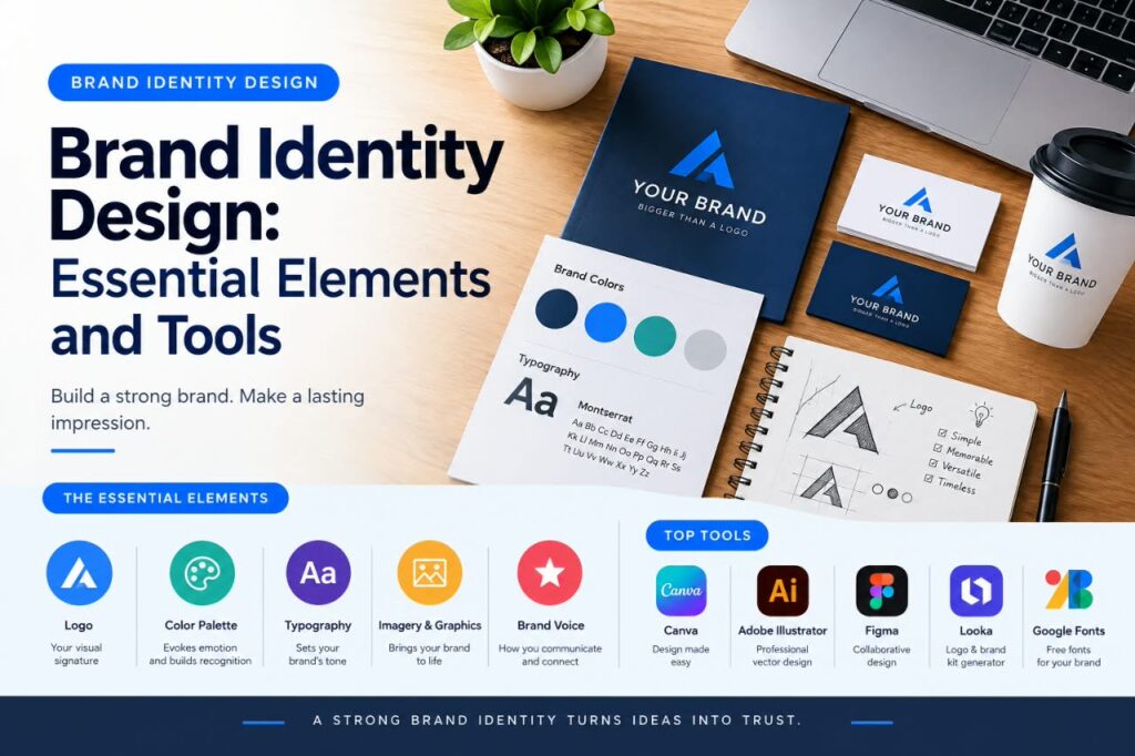
A strong brand is more than a logo. Brand identity design brings together the visual and communication elements that help a business present itself consistently across its website, social media, packaging, presentations, and other customer-facing materials.
For a small business or new brand, creating an identity can seem complicated. There are many decisions to make, including colors, typography, logo design, imagery, layouts, and the overall tone of communication.
The good news is that these decisions can be organized into a practical system. By defining the essential elements first and choosing appropriate design tools, businesses can create a recognizable identity without making every design decision from scratch.
This guide explains the main parts of brand identity design, how they work together, and what to consider when selecting tools for the process.
What Is Brand Identity Design?
Brand identity design is the process of creating the visual and communication elements that represent a brand.
It can include:
- Logo and logo variations
- Brand colors
- Typography
- Photography and imagery
- Graphic elements
- Layout principles
- Icons and illustrations
- Packaging or marketing materials
- Brand guidelines
- Written communication style
These elements should work together rather than being treated as unrelated design choices.
For example, a technology company might use a simple logo, a limited color palette, modern typography, and clean layouts across its website and social media. A children’s educational brand might use a very different visual system.
The objective is not simply to make individual designs attractive. The identity should provide a consistent framework for presenting the brand.
Why Brand Identity Design Matters
A consistent identity can make everyday marketing and design work easier because a business has established rules to follow.
Creates Visual Consistency
Without defined design choices, a company’s website might use one set of colors while its social media graphics use completely different colors and typography.
A basic identity system gives designers and content creators a common reference.
Helps People Recognize a Brand
Repeated use of distinctive visual elements can make a brand easier to recognize across different channels.
Recognition does not come from a logo alone. Colors, typography, imagery, layouts, and other recurring elements can contribute to the overall visual identity.
Supports Professional Communication
A consistent presentation can make business materials feel more organized.
This can apply to:
- Business cards
- Proposals
- Presentations
- Social media posts
- Websites
- Email graphics
- Product packaging
- Advertisements
The identity should support these materials rather than making them unnecessarily complicated.
Makes Future Design Work Easier
Once important design decisions have been established, creating new materials can become more straightforward.
Instead of deciding on a new color or font every time a social post is created, the designer can work within the existing system.
What a Simple Brand Identity System Can Look Like
To understand how the different parts of a brand identity work together, consider a fictional small business called Northline Marketing, a company that provides digital marketing services to small businesses.
Instead of treating every design decision separately, the business could create a simple identity system where each element has a specific purpose:
- Logo: A simple wordmark that is easy to use across the website, social media profiles, and business documents.
- Primary color: Used for important brand elements such as buttons, headings, and selected graphic details.
- Secondary color: Used for supporting graphics, backgrounds, or visual accents.
- Typography: One typeface for headings and another for body text to create a clear visual hierarchy.
- Imagery: Clean, professional photography that reflects the company’s services and target audience.
- Brand voice: Friendly, clear, and straightforward communication across website content and marketing materials.
The important point is that these elements are not selected independently. They are designed to support the same overall direction.
For example, if the brand aims to appear professional and approachable, its typography, colors, imagery, and written communication should generally support that impression. This makes it easier to create new materials without making completely different design decisions each time.
This example is fictional, but the same approach can be applied to many small businesses. Start with the brand’s audience and personality, then choose visual and communication elements that work together consistently.
Essential Elements of Brand Identity Design
A useful brand identity normally contains several connected elements. Not every business needs the same level of complexity, but the following components provide a strong starting point.
Logo Design
The logo is one part of a brand identity rather than the entire identity.
A logo should work in the situations where the business needs to use it, such as websites, social profiles, documents, packaging, or signage.
Consider Different Logo Variations
A practical identity may include:
- Primary logo
- Horizontal or vertical variation
- Simplified mark
- One-color version
- Light and dark versions
Having variations can make the identity easier to use across different backgrounds and formats.
Avoid Overcomplicating the Logo
A logo does not need many visual effects or complicated details to communicate effectively.
Consider whether it remains recognizable when displayed at a small size. A design that works on a large presentation may not work equally well as a small social media profile image.
Where Each Logo Version Can Be Used
Primary logo: Best suited for places such as the main website header, business documents, and larger brand placements.
Simplified mark: Useful for small spaces such as social media profile images or website icons where the full logo may not remain clear.
One-color version: Can be useful for documents, printing, stamps, or situations where a full-color logo is not practical.
Horizontal version: Can work well in website navigation, banners, and other wide layouts where horizontal space is available.
Light version: Designed for use on dark or visually busy backgrounds where the standard logo may not provide enough contrast.
Brand Color Palette
Color is another important part of visual identity.
Instead of selecting many unrelated colors, establish a manageable palette.
A basic system might contain:
- Primary color
- Secondary color
- Accent color
- Neutral colors
- Background colors
Think About Practical Use
A color palette should work across different materials.
For example, if an accent color is difficult to read when used for text, it may be better reserved for decorative elements rather than body copy.
Accessibility should also be considered when selecting text and background combinations.
A Practical Way to Assign Brand Colors
Instead of choosing colors without a clear purpose, a brand can assign a specific role to each part of its color palette. This makes the visual system easier to apply consistently across websites, social media graphics, presentations, and other marketing materials.
- Primary color: Used for major brand elements such as prominent headings, important design elements, or selected calls to action.
- Secondary color: Used for supporting sections, illustrations, secondary graphics, or other visual elements that complement the primary color.
- Accent color: Used sparingly to draw attention to buttons, highlights, links, or important details.
- Neutral colors: Used for backgrounds, body text, borders, and other areas where a less prominent color is appropriate.
The exact role of each color can vary depending on the brand and the design context. The main goal is to give each color a clear purpose rather than using the entire palette randomly.
Example Brand Palette
The following is a fictional example of how a small business could organize its colors:
| Color Role | Example Color | Possible Use |
| Primary | Deep Blue | Main brand elements and prominent sections |
| Secondary | Soft Blue | Supporting graphics and sections |
| Accent | Warm Orange | Buttons and highlights |
| Neutral | Light Gray | Backgrounds and supporting areas |
| Text Neutral | Dark Gray | Body text and headings |
This is only a fictional example. A real brand should select colors based on its visual direction, audience, design requirements, readability, and where the identity will be used.
Typography
Typography refers to the fonts and typographic styles used by a brand.
A brand might define:
- Primary typeface
- Secondary typeface
- Heading style
- Body-text style
- Font weights
- Line spacing
- Text hierarchy
Keep Typography Manageable
Using too many unrelated fonts can make a design feel inconsistent.
For many small brands, a simple combination of one or two typefaces can provide enough flexibility for websites, presentations, and marketing materials.
The most important consideration is not simply whether a font looks attractive. It should also remain readable and work across the formats where the brand will appear.
How to Build a Simple Typography System
A simple typography system gives each text style a clear purpose. Instead of using different font sizes and styles randomly, a brand can define how typography should be used across websites, social media graphics, presentations, and other marketing materials.
- H1: Main page or article heading
- H2: Major section heading
- H3: Subsection heading
- Body: Normal reading text
- Button: Short action-oriented text
This hierarchy helps readers understand the structure of the content more easily. It also makes the brand look more consistent because headings, paragraphs, and action elements follow a predictable visual system.
Photography and Imagery
Images can strongly influence how a brand is perceived.
A brand may define preferences for:
- Photography style
- Image composition
- Lighting
- Subject matter
- Illustration style
- Background treatment
For example, a professional consulting company might prefer clean, realistic photography, while a creative business might use illustrations or more expressive imagery.
The important point is consistency. Randomly choosing completely different image styles can weaken the overall visual system.
Icons and Graphic Elements
Icons, shapes, patterns, illustrations, and other supporting graphics can add another layer to an identity.
These elements can help create a recognizable design language.
However, they should support the brand rather than compete with the logo, typography, or main content.
Brand Voice and Messaging
Brand identity is not limited to visual design.
The way a business communicates can also be part of its broader identity.
A company might choose to communicate in a tone that is:
- Professional
- Friendly
- Educational
- Direct
- Conversational
- Technical
The appropriate style depends on the audience and the type of business.
For example, a financial software company may need precise and professional communication, while a lifestyle brand may use a more conversational tone.
Brand Guidelines
A brand guideline document brings important decisions together in one place.
A simple guideline can include:
- Logo usage
- Color codes
- Typography
- Image direction
- Graphic elements
- Spacing rules
- Examples of correct usage
- Examples of incorrect usage
- Basic writing style
A small business does not necessarily need a large brand manual. Even a concise document can help maintain consistency.
Which Brand Identity Elements Should You Prioritize First?
Not every brand identity element needs the same level of attention at the beginning. Prioritizing the core elements first can make the design process more manageable and help create a consistent foundation before adding supporting details.
| Element | Priority | Why It Matters |
| Logo | High | Provides a core visual identifier |
| Color palette | High | Helps create visual consistency |
| Typography | High | Supports readability and visual hierarchy |
| Imagery | Medium | Helps shape the overall visual style |
| Icons and graphics | Medium | Supports communication and visual consistency |
| Brand guidelines | High | Helps maintain consistent use of the identity |
The priorities above are a practical starting point rather than a universal rule. The importance of each element can change depending on the business, audience, industry, and where the identity will be used.
For example, a digital product may need to spend more time defining typography, interface elements, and digital graphics, while a retail business may place greater emphasis on packaging, photography, and physical applications.
Starting with the core elements first can also prevent unnecessary design work. Once the logo, colors, typography, and overall visual direction are established, supporting elements can be developed around them.
How to Build a Brand Identity Step by Step
Creating an identity becomes easier when the process is divided into stages.
1. Understand the Brand
Start by defining what the business does and who it serves.
Consider questions such as:
- What products or services does the business provide?
- Who is the intended audience?
- What problem does it solve?
- What should customers understand about the business?
- Where will the identity be used?
These answers provide context for later design decisions.
2. Research the Market
Look at competitors and businesses serving similar audiences.
The purpose is not to copy their designs. Instead, research can reveal common visual patterns and opportunities for differentiation.
Create a simple reference board containing examples of:
- Logos
- Colors
- Typography
- Websites
- Social media designs
- Photography
Then identify patterns without reproducing another company’s identity.
3. Define the Visual Direction
Before designing the final logo, establish a general visual direction.
For example, the brand could aim for a style that is:
Clean, modern, approachable, and professional.
This direction can guide decisions about colors, typography, imagery, and layouts.
4. Develop the Core Elements
Build the main identity components in a logical order.
A practical sequence is:
- Visual direction
- Logo
- Color palette
- Typography
- Imagery
- Supporting graphics
- Brand guidelines
This approach helps keep individual elements connected.
5. Test the Identity
Do not evaluate the identity only on a large design screen.
Test it in realistic situations, such as:
- Website header
- Mobile screen
- Social media profile
- Social media post
- Business document
- Presentation
- Small logo placement
Testing can reveal problems that are not obvious during the initial design stage.
6. Document the System
Once the main choices are finalized, document them.
A simple brand guideline might specify the exact colors, fonts, logo variations, and basic usage rules.
This document can then become a reference for future design work.
Tools for Brand Identity Design
The best tool depends on the type of work, experience level, budget, and required output.
There is no single design application that is appropriate for every brand.
Canva
Canva is useful for creating social media graphics, presentations, marketing materials, and other everyday brand assets.
Its templates and visual editing tools can be convenient for teams that need to produce content quickly.
However, businesses that require highly customized vector artwork or more advanced design control may eventually need a different tool.
Who Should Consider Canva?
Canva may be suitable for users who need to create social media graphics, presentations, and marketing materials without requiring advanced vector-design workflows.
What to Consider
Users who need detailed vector editing or more advanced logo-creation workflows may prefer a specialized vector design application.
Adobe Illustrator
Adobe Illustrator is designed for vector-based graphic design and can be useful for creating logos, icons, illustrations, and other scalable artwork.
It provides more detailed control than many template-based design platforms, although its learning curve can be higher for beginners.
Who Should Consider Adobe Illustrator?
Adobe Illustrator may be suitable for users who need detailed vector-based design, professional logo creation, custom shapes, and precise control over visual elements. It can be useful when a brand identity requires artwork that needs to remain editable and scalable across different sizes.
What to Consider
Users who are new to professional design software may need more time to learn Illustrator’s tools and workflow. It may also provide more features than necessary for simple social media graphics or basic marketing materials.
Adobe Express
Adobe Express provides tools for creating social graphics, promotional materials, and other visual content.
It can be useful when a business wants a relatively accessible design workflow while working within the broader Adobe ecosystem.
Who Should Consider Adobe Express?
Adobe Express may be suitable for users who want to create marketing graphics, social media content, presentations, and other branded materials through a relatively straightforward design workflow. It can be useful for businesses that need to produce visual content without relying on a complex professional design process.
What to Consider
Users who need advanced vector editing, highly customized logo construction, or detailed control over individual design elements may need a more specialized design application.
Affinity
Affinity’s creative applications can be considered by designers looking for professional design software with detailed editing capabilities.
Its suitability depends on the specific type of work, operating system, and features required.
Who Should Consider Affinity?
Affinity may be suitable for users who want more detailed control over graphic design and visual assets while working with professional design features. It can be considered for projects that require greater customization than basic template-based design tools typically provide.
What to Consider
Users should consider the specific Affinity application and the type of work they need to complete, because different design tasks may require different capabilities. Beginners may also need some time to become familiar with a more advanced design workflow.
Figma
Figma is widely used for interface and collaborative design work.
For a brand identity project, it can be useful for creating brand presentations, website mockups, design systems, and collaborative layouts.
Its role may be particularly relevant when brand identity work needs to connect closely with website or product design.
Who Should Consider Figma?
Figma may be suitable for teams and designers working on websites, digital products, interfaces, and collaborative design projects. Its workflow can be useful when multiple people need to review, edit, or provide feedback on design work.
What to Consider
Figma may not be the first choice for every traditional branding task, particularly when the main requirement is detailed vector illustration or print-focused graphic production. Users should consider whether their brand identity work is primarily digital, collaborative, or illustration-focused.
Brand Identity Design Tools Compared
| Tool | Useful For | Strength | Potential Limitation |
| Canva | Social graphics and marketing materials | Easy content creation | Less control for complex custom artwork |
| Adobe Illustrator | Logos and vector graphics | Detailed vector control | Higher learning curve |
| Adobe Express | Marketing and social content | Accessible workflow | Not intended to replace every professional design tool |
| Affinity | Professional graphic design | Detailed creative control | Workflow and features depend on the specific application |
| Figma | Digital and collaborative design | Collaboration and interface design | May not be the ideal choice for every print-focused project |
The comparison is not a ranking. The right choice depends on the brand’s workflow, design requirements, budget, and level of expertise.
How We Evaluated These Brand Identity Tools
To make the comparison more useful, these tools can be evaluated based on several practical factors rather than simply listing their features. The goal is to understand which type of workflow each tool may support.
- Ease of use: How easy the platform is to learn and use for common design tasks.
- Logo and vector capabilities: How well the tool supports creating and editing logos, shapes, and other vector-based graphics.
- Templates: The availability and usefulness of ready-made templates for marketing and brand materials.
- Collaboration: Features that can support teamwork, feedback, sharing, or collaborative design workflows.
- Brand asset management: Options for organizing or applying brand colors, fonts, logos, and other visual assets consistently.
- Learning curve: How much time or design knowledge may be needed to become comfortable with the tool.
- Suitable use cases: The types of projects and users the tool may be most suitable for, such as social media graphics, professional logo design, presentations, or interface design.
- Pricing model: How the tool is offered, such as free access, paid plans, one-time purchase options, or a combination of plans.
These criteria are used to understand differences between the tools rather than to rank them from “best” to “worst.” A tool that works well for creating quick marketing graphics may not provide the same workflow as professional vector design software or a collaborative interface design platform.
The right choice therefore depends on the brand’s needs, design experience, team structure, project type, and preferred workflow.
Brand Identity Design: Choosing a Tool by Workflow
Choosing a design tool becomes easier when you start with the type of work you need to complete rather than choosing a platform based only on its popularity or number of features.
| Main Need | Tool Type to Consider |
| Social media graphics | Template-based design platform |
| Professional logo and vector work | Vector design software |
| Website or product interface | Collaborative UI design tool |
| Presentations and marketing assets | Content design platform |
| Advanced graphic design | Professional creative software |
The table provides a general starting point rather than a fixed rule. Some tools can support multiple workflows, while others are designed around more specific types of creative work.
For example, a small business that mainly creates social media posts may prioritize ease of use and templates. A designer creating a detailed logo may need stronger vector-editing capabilities. A team building a website or digital product may place greater importance on collaboration and interface design.
The most suitable tool therefore depends on the project’s requirements, the user’s experience, the type of brand assets being created, and how the design will be used.
Example: Building a Simple Brand Identity for a Small Business
The following is a fictional example showing how the different parts of a brand identity can work together. It is not based on a real company or personal client project.
Imagine a small online marketing consultancy called Northline Marketing. The business helps small companies improve their digital marketing and online presence.
Define the Audience
Northline Marketing is designed for small businesses that may need practical marketing support but do not have a large in-house marketing team.
Establish the Brand Personality
The brand personality could be professional and approachable. The visual identity should therefore feel organized and trustworthy while remaining simple and welcoming.
Create the Logo
A simple wordmark could be used as the primary logo. A clean design would make the business name easy to recognize across a website, social media profiles, presentations, and business documents.
Choose the Colors
The fictional brand could use a dark primary color, a light neutral color, and one accent color.
- Dark primary: Main brand elements and prominent sections
- Light neutral: Backgrounds and supporting areas
- Accent color: Buttons, highlights, and selected visual details
Using clear roles for each color can make the identity easier to apply consistently.
Select Typography
A clean sans-serif typeface could be used for headings and body text. Different weights and sizes would create a clear hierarchy between main headings, section headings, paragraphs, and short action text.
Define the Imagery
Professional business and workspace photography could support the brand’s visual direction. Images should generally use a consistent style so that social media posts, website pages, and other marketing materials feel connected.
Create Social Media Templates
Instead of designing every social media post from scratch, Northline Marketing could create a small set of reusable templates. These templates could use the same logo placement, colors, typography, spacing, and general layout.
Create Simple Brand Guidelines
The final identity could be documented in a one-page reference document covering the logo, colors, typography, imagery style, and basic usage rules.
This example shows how individual design decisions can work together as one system. The goal is not to make every brand look the same, but to create a consistent visual direction that fits the business, its audience, and the channels where the identity will be used.
How to Choose the Right Brand Design Tool
Before selecting a tool, consider what you actually need to create.
For Simple Marketing Graphics
A template-based platform may be sufficient for social posts, presentations, and basic marketing materials.
For Professional Logo Creation
A vector-focused application can provide greater control over shapes, paths, and scalable artwork.
For Website and Product Design
A collaborative interface-design platform may be more appropriate when brand identity needs to be applied directly to websites or digital products.
For a Small Team
Ease of use and collaboration may matter more than having every advanced design feature.
The goal is to select a tool that fits the work rather than choosing software simply because it is popular.
Common Brand Identity Design Mistakes
Even a carefully planned identity can become less effective when the system is difficult to use.
Using Too Many Colors
Problem: Using too many unrelated colors can make a brand’s visual system difficult to keep consistent across websites, social media graphics, presentations, and other materials.
Better approach: Define a small core palette and assign a clear purpose to each color. For example, use a primary color for major brand elements, a secondary color for supporting visuals, an accent color for highlights, and neutral colors for backgrounds and text.
Changing Fonts Frequently
Problem: Using different fonts for every design can make the brand look inconsistent and make it harder for readers to recognize a common visual style.
Better approach: Create a simple typography hierarchy with defined roles for headings, subheadings, body text, and short action text. Consistently applying these roles can make different brand materials feel more connected.
Copying Competitors
Problem: Closely imitating another company’s logo, colors, typography, or overall visual style can make a brand less distinctive and may create confusion between businesses.
Better approach: Research competitors to understand common visual patterns and identify opportunities to create a different direction. Use research as a source of information rather than a template to copy.
Designing Only for One Platform
Problem: A brand identity that looks good in one format may not work equally well on a website, social media profile, mobile screen, printed document, or presentation.
Better approach: Test the identity across multiple formats and prepare suitable variations of important assets, such as logos, layouts, and image treatments. This helps the system remain recognizable while adapting to different spaces.
Ignoring Accessibility
Problem: Poor contrast, difficult-to-read typography, or overly complex visual layouts can make brand content harder for some people to read or understand.
Better approach: Check text readability and color contrast, use appropriate font sizes, and avoid relying only on color to communicate important information. Accessibility should be considered as part of the design process rather than added at the end.
How to Keep Brand Identity Consistent
Consistency does not mean every design must look identical.
Instead, recurring elements should create a recognizable visual relationship.
A useful system might establish:
- Consistent logo placement
- Defined colors
- Standard typography
- Reusable graphic elements
- Consistent image treatment
- Predictable spacing
- Clear content hierarchy
Templates can also help teams apply these rules without rebuilding every design from the beginning.
What to Consider Before Investing in Design Tools
A more expensive application does not automatically produce a better brand identity.
Before paying for a tool, consider:
- What type of designs you need to create
- Whether you need vector editing
- Whether collaboration is important
- Which operating systems you use
- Whether templates are useful
- Whether the tool supports your required file formats
- Whether the pricing fits your budget
- How much time you can spend learning the software
Free or lower-cost tools can be appropriate for some projects, while professional design workflows may require more advanced software.
Always check the tool provider’s official website for current pricing, features, licensing terms, and availability because these details can change.
Frequently Asked Questions
What is brand identity design?
Brand identity design is the process of developing the visual and communication elements used to represent a business consistently. It can include logos, colors, typography, imagery, graphic elements, and brand guidelines.
Is a logo the same as a brand identity?
No. A logo is one component of a broader brand identity. Brand identity can also include colors, typography, imagery, layouts, graphic elements, and communication guidelines.
What tools can I use for brand identity design?
The appropriate tool depends on the project. Canva and Adobe Express can be useful for everyday marketing graphics, while Illustrator and Affinity can provide more detailed graphic-design control. Figma can be useful for collaborative digital design and interface work.
How many colors should a brand have?
There is no universal required number. A practical identity often uses a limited core palette with primary, secondary, accent, and neutral colors. The important consideration is whether the colors work together and can be applied consistently.
Can a small business create its own brand identity?
Yes. A small business can establish a basic identity by defining its audience, visual direction, logo, colors, typography, imagery, and basic usage rules. More complex projects may benefit from professional design expertise.
Conclusion
Brand identity design is a system rather than a single logo or graphic. A well-organized identity brings together visual elements such as logos, colors, typography, imagery, and supporting graphics while also providing guidance for consistent communication.
The process can start with a clear understanding of the business and its audience, followed by research, visual direction, design development, testing, and documentation.
Choosing the right design tool is also important, but the software itself does not determine the quality of the identity. The better approach is to choose tools based on the type of work, required control, collaboration needs, budget, and experience level.
For businesses building an identity from scratch, starting with a simple and consistent system can provide a practical foundation for future websites, marketing materials, social media content, and other brand communications.